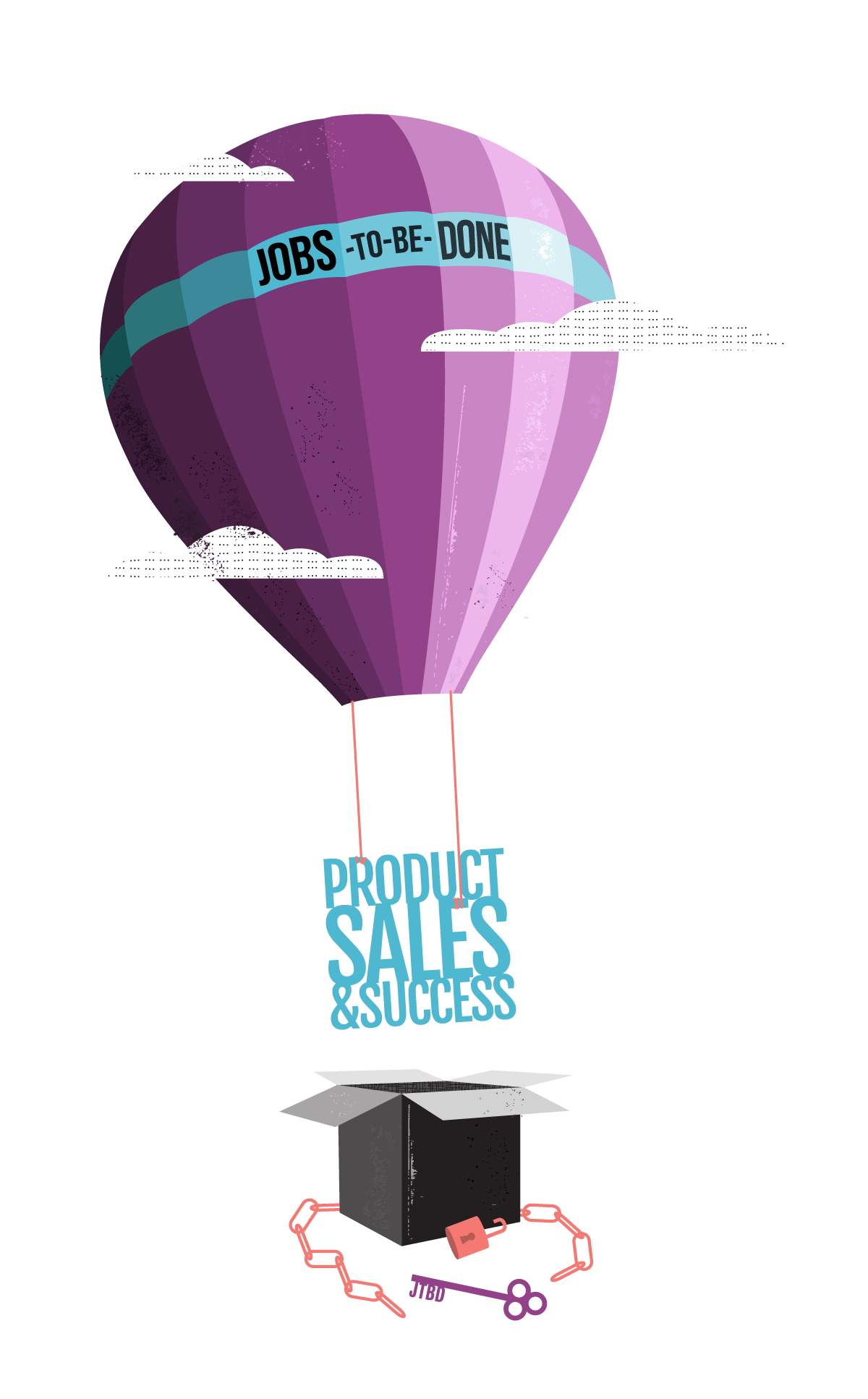
JOBS-TO-BE-DONE INFOGRAPHIC
Why do commuters drink milkshakes for breakfast? Clayton Christensen, the famed Harvard Business School Professor known for coining the term “disruptive innovation,” believes that morning milkshakes have a job to be done. He developed a framework that says: don’t sell products and services to customers, but rather try to help people address their desired progress, their jobs to be done.
Alan Klement, an entrepreneur and frequent contributor to Medium, reached out to me to build an infographic that could prime those new to and interested in the JTBD framework. Specifically he asked, how could we take a complex, often cold subject like business theory and give it warmth, some fun, and a human touch?
I worked with Alan to develop the copy and illustration style, then created 11 creative assets for the infographic. Our end result visually conveys the key principles and practices of the JTBD framework quickly and clearly, and we hope helps businesses and designers more accurately develop and market products well-tailored to the progress customers are already trying to make in their lives. Here's a look at the process.
Starting blocks
The first challenge was identifying the various concepts we wanted to cover, how we could group them, in what order they should they be communicated, and what initial illustration ideas were possible. It looked like a lot of writing and sketching.
Simple style
For the the style, there was no existing brand Alan needed to follow. But we wanted something simple, clean, and approachable, so I went with vector vs. hand-drawn and geometric curves vs. slightly imperfect lines and angles. I added some patterns and textures for depth and dimension. With the color, I wanted different color schemes to help group and separate different sections of the infographic. Below are some initial color schemes and textures we considered.
Familiar Themes
For the illustrations, I wanted to convey complicated ideas and terms simply, so explored various consumer products that most everyone is familiar with. We went with transporting documents and food mainly because they were so ubiquitous. Plus how a letter travels has looked different over time, but what's remained the same is the job to be done. Food had so many options to play with that was perfect in conveying options like "hiring" one product and "firing" another.
Relatable emotions and thoughts
What happens in a customer's mind as they buy products and what are the emotions behind a purchase? I wanted to use dialogue and make the emotional energy and psychology behind a customer situation come alive . We specifically looked at when two different products, an old familiar one and a new one, compete. We anchored it in a concrete scenario: deciding whether or not to replace your grill with a new one.
Engaging diagrams
As a way to help viewers utilize the JTBD framework, we wanted to share with them ways to apply it. I was given descriptions and diagrams that explained 3 practices: the interview, the forces diagram, and the timeline. To make them engaging, I used characters, a familiar tug of war metaphor, and returned to the scenario of buying a new grill.
After creating all the final assets for the infographic, Alan and I picked out fonts and he did an amazing job laying out the various sections and illustrations. I really love how this collaboration came together in the end and loved getting to know the JTBD framework on a deeper level. I believe it's important to make concepts like business theories accessible and nonintimidating to all, and one way to do that is by presenting it with friendliness. There is so much personality that these illustrations add to the JTBD framework, and I hope the viewers found it not only helpful but easy to apply to their own work within innovation and design.


